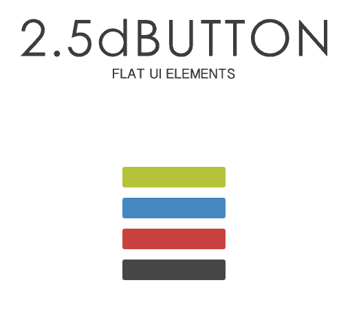
今、はやりのフラットデザイン風ボタンをアイコン付きで簡単に作れるツールがあったので紹介します。
2.5dBUTTON
そのサイトですが「NOHT・2.5dBUTTON」。マウスを重ねることでで 凸、マウスオンで凹のフラットなボタンをジェネレータで自由に、しかも簡単に作れます。
デフォルトの画面は次のようになっています。
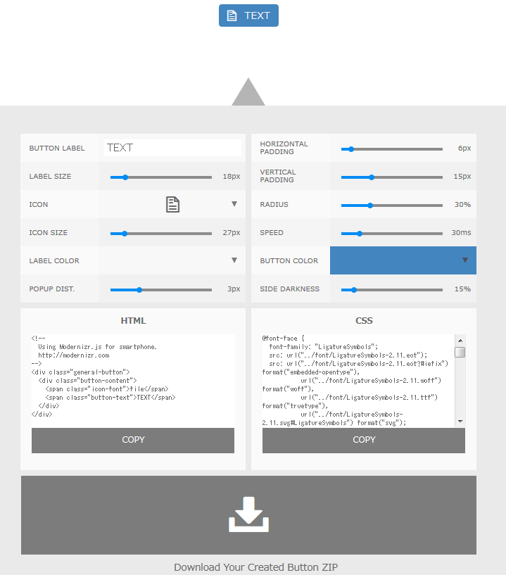
ツールの構成ですが、ボタンのテキスト入力、テキストのサイズ変更、アイコンの種類(全部で241種類あります)、テキスト・アイコンのカラー選択等、全部で10種類の設定項目があり、それぞれの設定を行ってHTMLコード、CSSコードのコピー、もしくはZIPファイル作成用のボタンをクリックすることでオリジナルのフラットデザイン風のボタンが作成出来ます。
実際にRSS用のボタンを作成してみました。
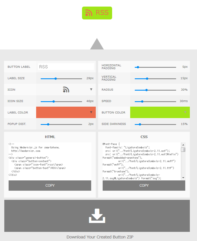
コードを見てみると次のような感じです。
HTMLコードサンプル
<!--
  Using Modernizr.js for smartphone.
  http://modernizr.com
-->
<div class="general-button">
  <div class="button-content">
    <span class="icon-font">rss</span>
    <span class="button-text">RSS</span>
  </div>
</div>
CSSのコードサンプル
@font-face {
  font-family: "LigatureSymbols";
  src: url("../font/LigatureSymbols-2.11.eot");
  src: url("../font/LigatureSymbols-2.11.eot?#iefix") format("embedded-opentype"),
           url("../font/LigatureSymbols-2.11.woff") format("woff"),
           url("../font/LigatureSymbols-2.11.ttf") format("truetype"),
           url("../font/LigatureSymbols-2.11.svg#LigatureSymbols") format("svg");
  font-weight: normal;
  font-style: normal;
}

.icon-font {
  font-family: "LigatureSymbols";
  -webkit-text-rendering: optimizeLegibility;
  -moz-text-rendering: optimizeLegibility;
  -ms-text-rendering: optimizeLegibility;
  -o-text-rendering: optimizeLegibility;
  text-rendering: optimizeLegibility;
  -webkit-font-smoothing: antialiased;
  -moz-font-smoothing: antialiased;
  -ms-font-smoothing: antialiased;
  -o-font-smoothing: antialiased;
  font-smoothing: antialiased;
  -webkit-font-feature-settings: "liga"1, "dlig"1;
  -moz-font-feature-settings: "liga=1, dlig=1";
  -ms-font-feature-settings: "liga"1, "dlig"1;
  -o-font-feature-settings: "liga"1, "dlig"1;
  font-feature-settings: "liga"1, "dlig"1;
}

/*------------------------------------------
// User style start
// change
----------------------------------------- */

.general-button  {
  border-radius: 8px;
  background-color: #a1e519;
}

.general-button:before  {
  border-radius: 8px;
  border-bottom: 0px solid rgba(83,118,12, 0);
  background-color: rgba(83,118,12, 0);
}

.button-content  {
  border-radius: 0px 0px 8px 8px;
  padding: 5px 7.5px;
  box-shadow: 0px 0px 0px 0px rgba(83,118,12, 0);
  color: #eb6e4e;
}

.button-text  {
  padding: 0px 7.5px;
  line-height: 1.6em;
  font-size: 29px;
}

.icon-font  {
  padding: 0px 7.5px;
  font-size: 46px;
}

/*----------------- at hover -----------------*/

.general-button:hover  {
  top: -2px;
  transition: all 30ms;
  -moz-transition: all 30ms;
  -webkit-transition: all 30ms;
  -o-transition: all 30ms;
  background-color: #a6e725;
}

.general-button:hover:before  {
  border-bottom: 2px solid rgba(83,118,12, 0);
  transition: all 30ms;
  -moz-transition: all 30ms;
  -webkit-transition: all 30ms;
  -o-transition: all 30ms;
}

.general-button:hover .button-content  {
  box-shadow: 0px 2px 0px 0px rgba(83,118,12, 1);
  transition: all 30ms;
  -moz-transition: all 30ms;
  -webkit-transition: all 30ms;
  -o-transition: all 30ms;
}

/*----------------- at active -----------------*/

.general-button:active  {
  background-color: #90ce16;
  box-shadow: 0px 1.4px 0px 0px rgba(67,95,10, 1) inset;
}

.general-button:active:before  {
  top: -2px;
  padding-bottom: 2px;
  border-bottom: 0px solid rgba(83,118,12, 0);
}

.general-button:active .button-content  {
  box-shadow: 0px 0px 0px 0px rgba(83,118,12, 0);
}

/*------------------------------------------
// User style end
----------------------------------------- */

/*------------------------------------------
// Core style start
// not change
----------------------------------------- */

.general-button  {
  display: -moz-inline-box;
  display: inline-block;
  user-select: none;
  -moz-user-select: none;
  -webkit-user-select: none;
  -ms-user-select: none;transition: all 0ms;
  -moz-transition: all 0ms;
  -webkit-transition: all 0ms;
  -o-transition: all 0ms;position: relative;
  top: 0px;
  cursor: pointer;
  text-decoration: none;
  line-height: 1;
}

.general-button:before  {
  content: '';
  position: absolute;
  top: 0;
  left: 0;
  width: 100%;
  height: 100%;
}

.button-content  {
  display: table;
  transition: all 0ms;
  -moz-transition: all 0ms;
  -webkit-transition: all 0ms;
  -o-transition: all 0ms;
}

.button-text  {
  display: table-cell;
  vertical-align: middle;
  text-decoration: none;
}

.icon-font  {
  display: table-cell;
  vertical-align: middle;
}

/*----------------- at hover -----------------*/

.general-button:hover  {
  transition-timing-function: ease-in-out;
}

.general-button:hover:before  {
  transition-timing-function: ease-in-out;
}

.general-button:hover .button-content  {
  transition-timing-function: ease-in-out;
}

/*----------------- at active -----------------*/

.general-button:active  {
  top: 0px;
  transition: all 0ms;
  -moz-transition: all 0ms;
  -webkit-transition: all 0ms;
  -o-transition: all 0ms;
}

.general-button:active:before  {
  transition: all 0ms;
  -moz-transition: all 0ms;
  -webkit-transition: all 0ms;
  -o-transition: all 0ms;
}

.general-button:active .button-content  {
  transition: all 0ms;
  -moz-transition: all 0ms;
  -webkit-transition: all 0ms;
  -o-transition: all 0ms;
}

/*------------------------------------------
// Core style end
----------------------------------------- */

/*------------------------------------------
// Touch style start
----------------------------------------- */

/*----------------- at hover -----------------*/

.touch .general-button:hover  {
  top: 0px;
  background-color: #a1e519;
}

.touch .general-button:hover:before  {
  border-bottom: 0px solid rgba(83,118,12, 0);
}

.touch .general-button:hover .button-content  {
  box-shadow: 0px 0px 0px 0px rgba(83,118,12, 1);

}

/*----------------- at active -----------------*/

.touch .general-button:active  {
  background-color: #90ce16;
  box-shadow: 0px 1.4px 0px 0px rgba(67,95,10, 1) inset;
}

.touch .general-button:active:before  {
  top: -2px;
  padding-bottom: 2px;
  border-bottom: 0px solid rgba(83,118,12, 0);
}

.touch .general-button:active .button-content  {
  box-shadow: 0px 0px 0px 0px rgba(83,118,12, 0);
}

/*------------------------------------------
// Touch style end
----------------------------------------- */
実際にこのCSSを作ろうとすると大変な作業量になります。
それがこのツールを使うと物の1~2分で出来てしまいます。
これは是非、使っていきたいですね。
最後に
今回、紹介したツールもそうですが、デザインのレベルを落とさずに作業の簡略化が出来るツールはどんどん取り入れていきたいですね。
また、今回紹介したサイトですがボタン作成ツールだけではなく、iPhoneの無料アプリや、オリジナルの缶バッジを作成できるサービス、AIファイルやPSDファイルを利用した様々なサービスを行っています。
デザイン系の方には是非、参考にしてもらいたいと思います。
コメント